Responsive Design
In April 2011 I launched this blog. It is a continuation of earlier blogs that ran on third party software. Last year I wrote my own application in WebDSL.
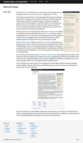
One of the greatest challenges in web programming I found to be the graphical design of sites. Achieving a web site with a modern look with CSS is much like programming a compiler in assembly language. It requires a considerable amount of low-level knowledge. So I was fairly satisfied with the design of my blog as seen in the screen shot on the right. The color scheme was based on Solarized, which was developed to optimize readability of code in editors. The font for the headers was some funny Google font.
However, there was one striking problem with the site. It was not very readable on mobile devices such as phones and tablets. So, I set out to develop a mobile web application in mobl. That project was orphaned when I had other projects to do. But I was also struggling with the motivation for the project; an offline-capable application for a blog/wiki site is not exactly what is needed.
For the WebLab project I had discovered Twitter Bootstrap, which makes web design a breeze. At least, it allows someone like me (with limited time to divulge in CSS hacking) to focus on the functional design and the high-level web design; as opposed to the ad hoc low-level CSS hacking that I was doing before. WebLab has a fixed size layout designed for a screen with 1024 pixels of resolution, as did my blog application.
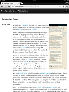
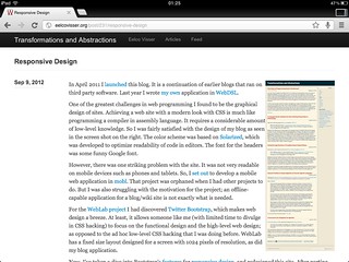
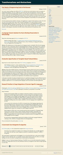
Now, I’ve taken a dive into Bootstrap’s features for responsive design, and redesigned this site. After porting the layout to Bootstrap, figuring out the drop down menus, and adapting the default Bootstrap CSS a bit, the main work was in making the header and footer menus configurable. The important difference with respect to the old design is that the sidebar is gone; the information has been moved to the header menus or to the itemized lists in the footer. In addition, I extended the wiki with a notion of groups, so that a set of wiki pages can share navigation menus.
You are looking at the result (unless you are reading this in a feed reader). Blog and wiki pages should be equally readable on phones, tables, laptops, and desktop computers. Even the images are automatically re-sized, without a minute of my time.
If you are interested in writing WebDSL applications with Bootstrap you will find my elib WebDSL library useful. It provides templates abstracting from common Bootstrap patterns. In addition it provides a bunch of other useful WebDSL utilities developed over the course of several projects.
Screenhots