Getting Things Done Responsively
In the past year or so I have spent a large portion of my time writing research proposals. While I’m still waiting on some of the funding decisions, the effort has at least produced a long list of exciting research plans. And I can’t wait to get started on getting those things done. Of course, that requires good tools.
To manage project issues, Sander Vermolen developed the YellowGrass issue tracker. It was a case study in software evolution with the WebDSL web programming language. But it also evolved into a good tool used in our software projects since early 2010 (replacing Jira). However, with the speed of the development of the web, the styling of the site had become stale and the navigation was suboptimal.
So, my programming project for the holidays was the responsive redesign of YellowGrass. Using the embedding of the twitter bootstrap CSS/JS framework in the WebDSL elib library.
Using bootstrap provides a modern look and feel out of the box that is consistently applied on all pages. (Although the bootstrap look is rapidly becoming rather too generic, so we’ll need some design skills soon to design something more distinctive.) I have chosen for a 15px font-size in order to keep readability on mobile devices. The original 9pt font of YellowGrass was much too small to my taste, even on the desktop.
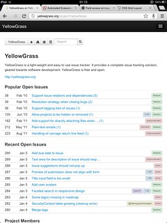
An important usability problem was the curiously incomplete navigation. For example, the page with all open issues of a project was only reachable from a link at the bottom of a project front page. In the new design, the project toolbar available at the top of the each page contains links to all pages of a project.
Most importantly I made the layout of the application responsive to the resolution of the browser window so that pages are accessible on phones and tablets. Bootstraps responsive.css does all the hard work of recomputing sizes of columns in the grid. However, one still has to fit an application into the grid in such a way that it displays well on different resolutions. In my first attempt I translated the original sidebars to grid columns, but that turned out very bad with very small sidebars at lower resolutions. So I ended up with a mostly vertical layout with icon-only toolbars at the top for navigation and operations.
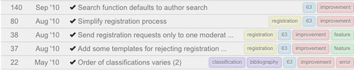
Another issue was the presentation of tables used for issue lists, lining up dates, titles, and tags. The rows in issue tables are now rendered as grid rows. The following screenshot shows how putting title and tags in a single column, with tags aligned right, allows the issue to be displayed on a single line more often:
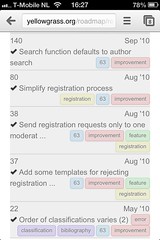
On small screens the columns in these rows degrade to full width divs. By right aligning dates and tags the result is somewhat acceptable on phone screens (see screenshot), but there is room for improvement. The application adapts well to desktop and tablet screens.
I am quite happy with the result and already started using YellowGrass more intensively. Of course, that generated lots of new ideas for further improving the application.
This was my second attempt at a responsive web application design. Although I am fairly satisfied with the results, they are not optimal. In particular, I would like to figure out how to make application designs that make better use of the very large displays that are available these days, yet can also be rendered on phones and tablets without server-side conditional code.
To be continued.